Data Visualization
Timeplus provides out-of-box streaming charts and dashboards to visualize the real-time data and understand the pattern/trend. You can also integrate Timeplus with your external BI systems, such as Redash, Metabase, Grafana, etc.
Chart
After you run a query, you can switch to the Visualization tab to turn the results into a chart. We offer different chart types for your use cases:
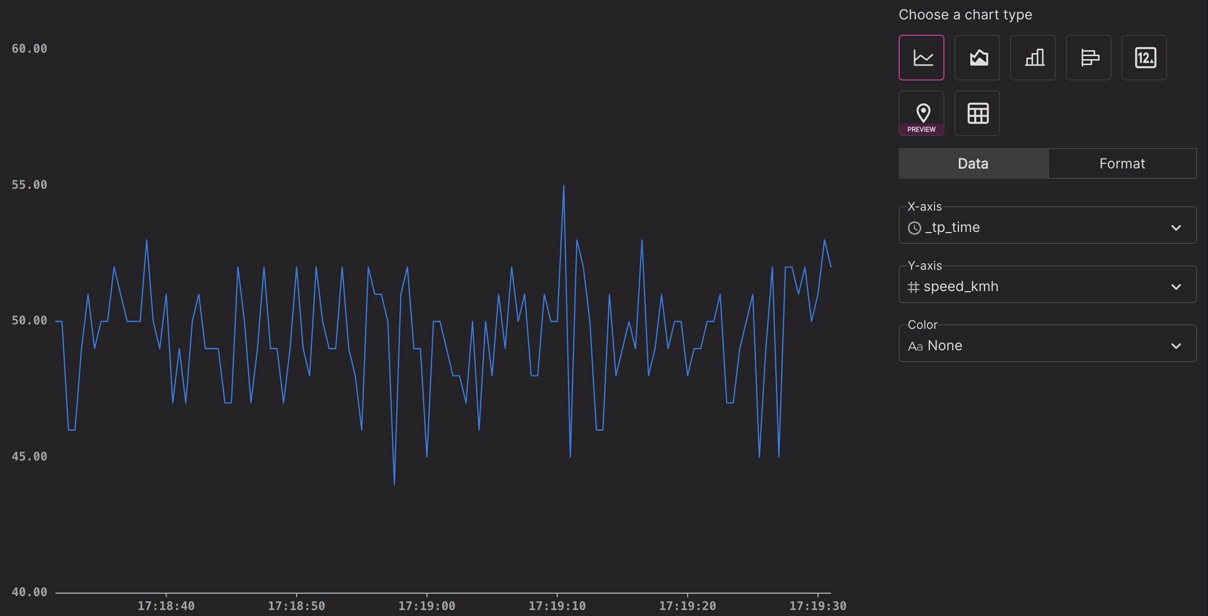
Line chart
Line charts work best with time series data.
-
Data settings:
- X-axis: Event Time (_tp_time), or Arrival Time(when the browser gets the data point), or a custom column.
- Y-axis: a custom column in numeric data types (int/float/etc)
- Color: by default
Noneis selected. You can choose a categorical column and draw a line for each unique value of the column value in different colors.
-
Format settings:
- X-axis title and the data range(last 1 minute, last 1 hour, all time, etc.). By default, 'Last 1 minute' is selected. If you are running a historical query, please change it to 'All time'.
- Y-axis title, min/max value, line color, style
- Show/hide the data label for the last value of the line chart, number of decimal and whether to show prefix/suffix as unit.
- Show/hide grid lines
- Show/hide legend
- Show/hide data points
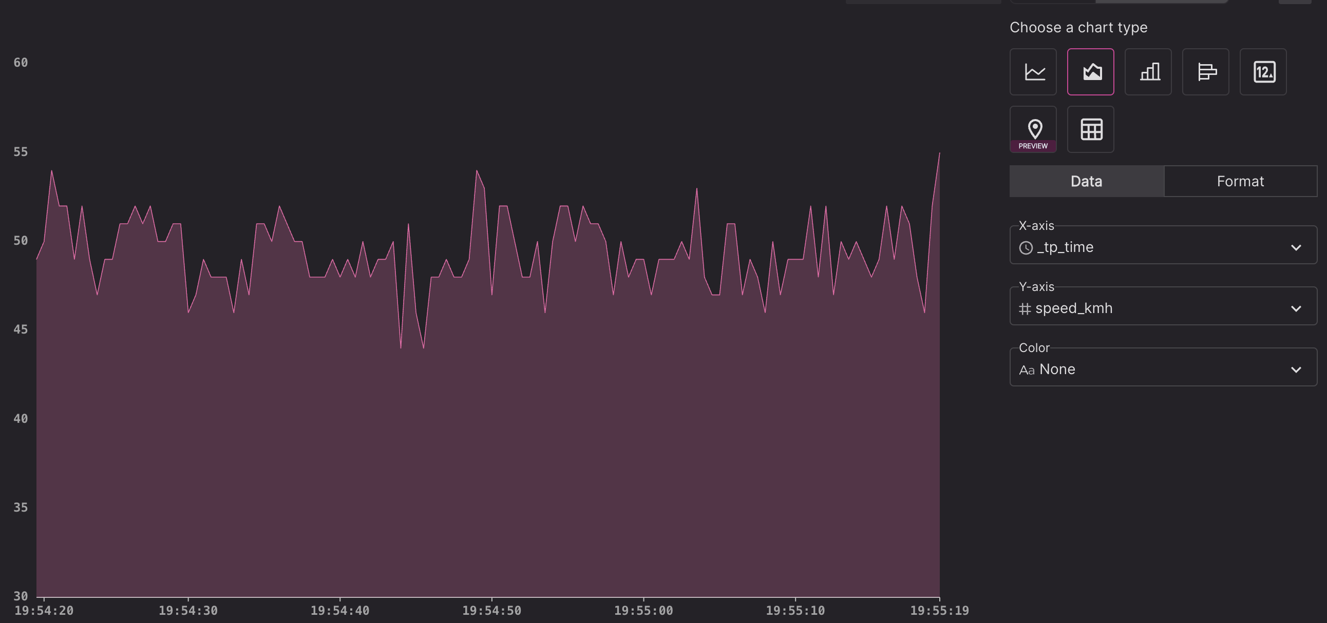
Area chart
Shows a stacked area chart, with the same format settings as Line Chart.
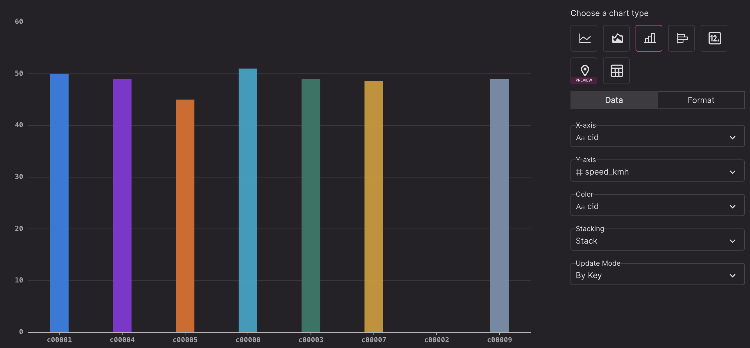
Column chart
-
Data settings:
- X-axis: a categorical column
- Y-axis: a numeric column
- Color: whether to show grouped data in either stack mode or dodge mode.
- Update mode: append only, or show data points from the last timestamp, or choose a key column to show the latest data value for each key value.
-
Format settings:
- X-axis title, Y-axis title, column color, show/hide data label (with decimal and prefix/suffix unit), show/hide grid lines, show/hide legend
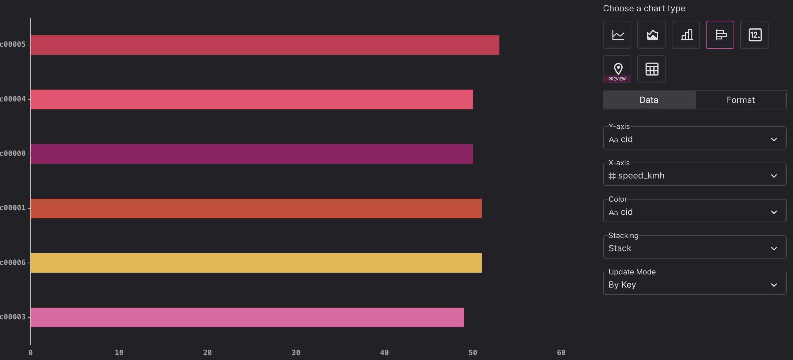
Bar chart
Similar to the Column chart, with data points shown as horizontal bars instead of vertical columns. Best fit for show top-N values.
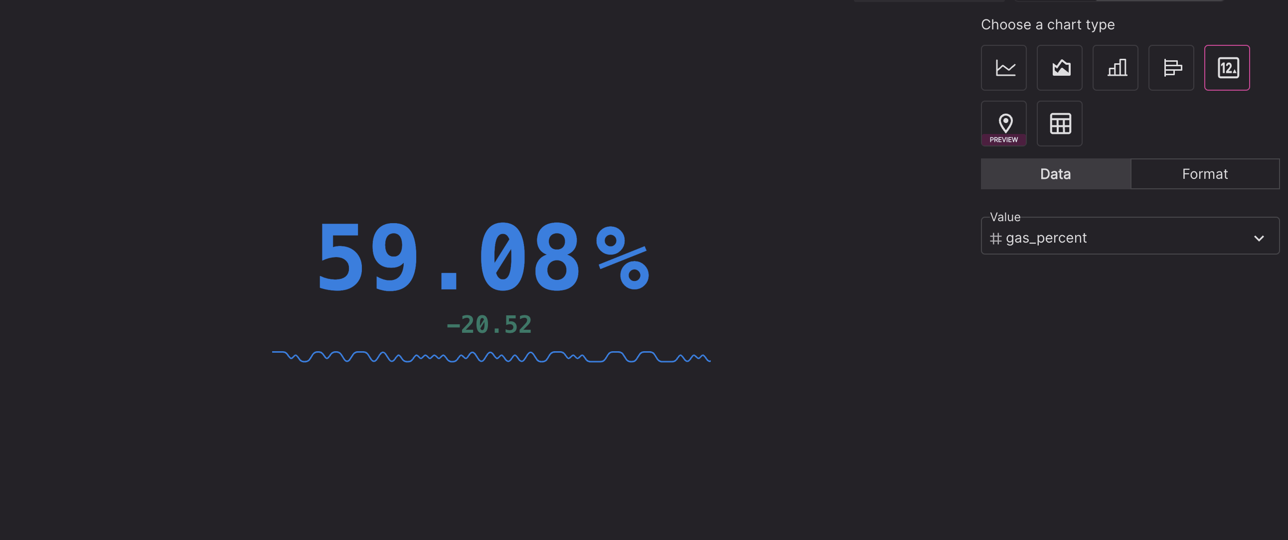
Single value chart
-
Data settings:
- choose a numeric column to show its value
-
Format settings:
- Number of decimal
- Font size
- Unit as suffix or prefix
- Show/hide sparkline
- Show/hide delta for last value vs. the current value
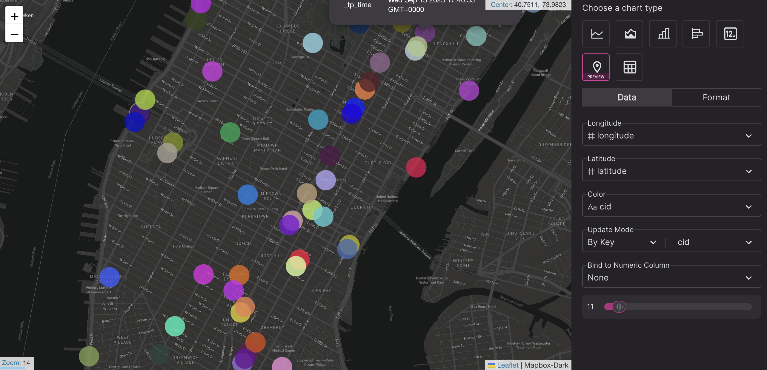
Map chart
-
Data settings:
- Set columns for longitude and latitude.
- Color: show grouped data in stack mode or dodge mode.
- Update mode: append only, or show data points from the last timestamp, or choose a key column to show the latest data value for each key value.
-
Format settings:
- Map dots: color scheme, opacity, and size (fixed size, or set a min. and max size)
OHLC chart
This is a new chart type, currently in technical preview. The open-high-low-close (OHLC) chart is common in the finance industry, to visualize the movement of prices over time. Please contact us if you'd like to try this preview feature.
Please make sure there are 5 columns with names: time, open, close, high, low, e.g.
SELECT window_start, earliest(price) AS open, latest(price) AS close,
       max(price) AS high, min(price) AS low
FROM tumble(prices, 1s) GROUP BY window_start
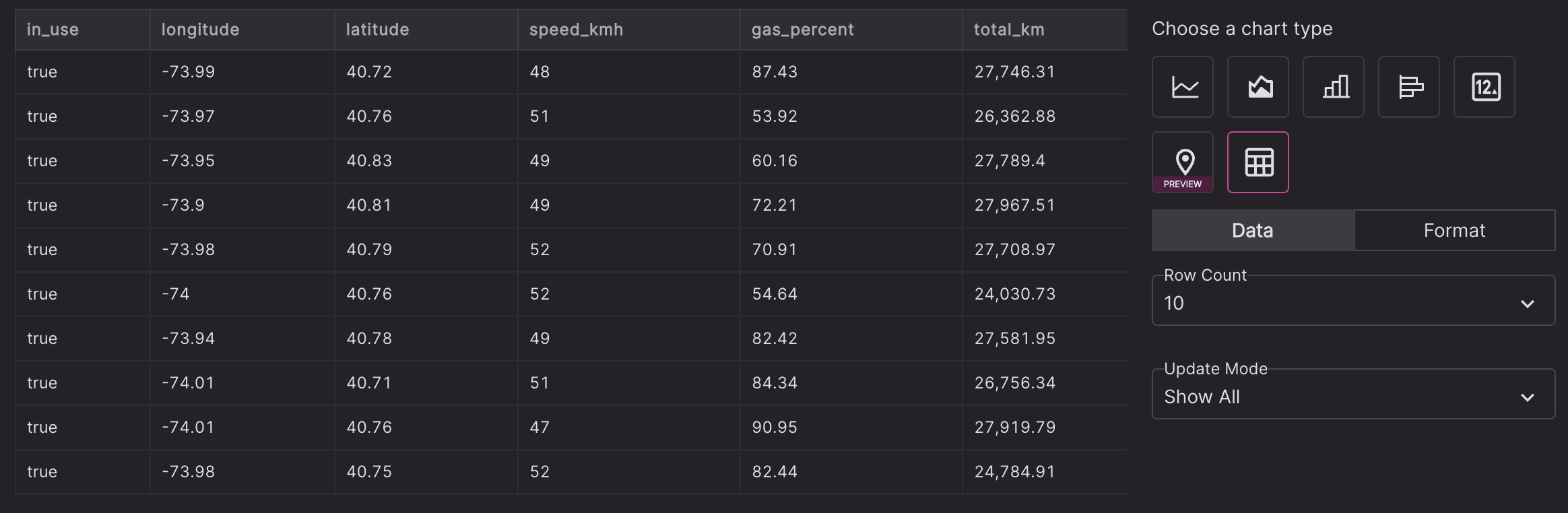
Table
Shows the data as a list table.
-
Data settings
- Maximum row count.
- Update mode:
- Show All: show all query results (limited by the maximum row count)
- By Time: show data points from the last timestamp
- By Key: choose a key column to show the latest row for each key value.
-
Format settings
- For each column, you can choose to show or hide it, or set column width and decimal for numeric columns.
- Conditional formatting: highlight a cell or an entire row if the value meets a certain condition you've set
Charts can be added to the dashboard by clicking the Add to dashboard button on the right.
Dashboard
One or more dashboards can be created in each workspace to tell stories about your data.
You can set a name and optional description for each dashboard.
One or more charts can be added to the dashboard, with 3 size options:
- Small: takes up 1/4 of the page width
- Medium: takes up 1/2 of the page width
- Large: takes up entire page width
Dashboard filters and query variables
As a new feature, you can add filters in dashboards. Here is an example if you want to list speeding vehicles.
First, in the query page, to run a SQL with a fixed condition, e.g.
select * from car_live_data where speed > 80
Run the query and make sure it meets your needs.
Then you can change the fixed condition with a query variable, e.g.
select * from car_live_data where speed > {{speed_limit}}
The query editor will show a text input for the value of speed_limit. You can put a value and run the parameterized query and turn it to a visualization and add it to a new dashboard or an existing dashboard.
Please make sure the SQL syntax is correct with query variables. For example if you are filtering with a string value, you should add quote around the variable placeholder, e.g.
select * from car_live_data where cid='{{car_id}}'
In the dashboard, you need to add a filter, either as a text input or a drop down. Define the variable id as speed_limit, set a label and default value. For drop down list, you can choose to load the options from a SQL (you should run a bounded queries to get distinct value, such as select distinct cid from table(dim_car_info))
After you save the dashboard, in the dashboard view mode, you can change the value of the filter. Those panels with SQL referring to the same variables will be re-ran.
Integration with External BI
You can use JDBC or ODBC drivers of Timeplus to run queries and visualized the results in various BI tools, such as Metabase.
We also released a Grafana data source plugin to visualize streaming SQL without refreshing the dashboard.
For highly customizable charts, you can also call Timeplus SDK to load the data and render the chart with 3rd party charting libraries.